**Previous Episode: [[BDE356]]**
**Next Episode: [[BDE358]]**
%%Post image thumbnail below.%%
> [!abstract|no-i] **Episode Overview**
**Date Aired:** [[08-27-2024]]
**Title:** The Illegible Infographic Phenomenon
**Episode:** 357
**Description:** There is an inverse relationship between the nefariousness of an organization and the unintelligible nature of its infographics. Ranking the best of the worst.
**Link:** https://rumble.com/v5cnqdh-big-dig-energy-357-the-illegible-infographic-phenomenon.html
**Tags:**
%%<https://historydraft.com/happened/what-happened/1-January/world>%%
## Replay
%% Get embed URL then highlight and hit ALT + I%%
<iframe src="https://rumble.com/embed/v5abhxx/?pub=6eeyh" allow="fullscreen" allowfullscreen="" style="height:100%;width:100%; aspect-ratio: 16 / 9; "></iframe>
<br>
## Greetings & Announcements
1. Hi!
## Segments
### The History of Infographics
#### 1600s
**Rosa Ursina sive Sol** by Christophe Scheiner. 1626.
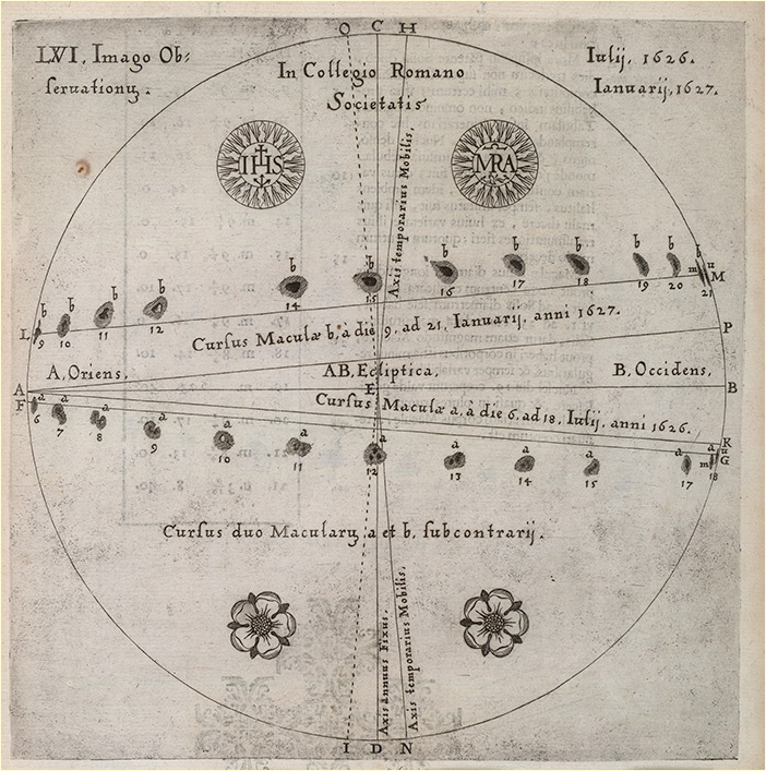
See: [Conserving a Classic Book on Sunspots](https://huntington.org/verso/conserving-classic-book-sunspots)
#### 1700s
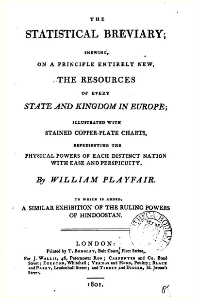
William Playfair is widely credited with introducing the first pie charts to the world in **The Statistical Breviary** in 1801.[^TSB] Playfair also invented and popularized bar, line, and area charts.
[^TSB]: Link: https://archive.org/details/statisticalbrev00playgoog/page/n10/mode/2up
“Making an appeal to the eye when proportion and magnitude are concerned, is the best and readiest method of conveying a distinct idea.” - William Playfair
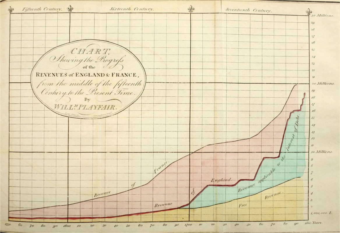
While his goal was to convey information, the methods Playfair used were surely art: he engraved copper plates and hand-colored each copy of the book in which he published them. He used methods shared with pen-and-ink drawing, such as stippling and hatching, to shade different areas. He also experimented with elements of design, as in his comparison of wheat prices to wages where he mixes bars and lines.

In an era of Excel and Google charts, it’s easy to forget that there was a time when making statistical graphics required a steady hand and an artist’s eye. To the modern Helvetica-adapted viewer, the swoopy lettering dancing along the chart lines and the hand-painted areas-under-curves and hand-drawn stippling would look entirely too artsy-fartsy for the hardcore statistical graphics enthusiast, but I think that's exactly what makes them interesting to look at.
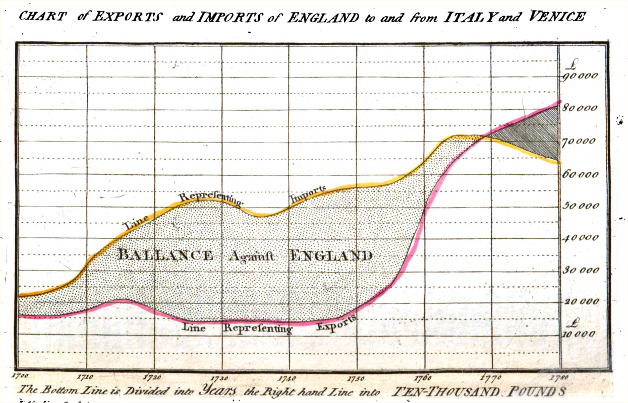
In browsing Playfair's work, I ended up reading a surprisingly large amount of Lineal Arithmetic — look at the flourish on this National Debt chart title! The national debt has never looked so good.
---
See: [A shout-out to William Playfair: rogue, scoundrel, and statistical graphics artist](https://www.linkedin.com/pulse/shout-out-william-playfair-rogue-scoundrel-graphics-barrilleaux/)
#### 1800s
Around 1820, modern geography was established by Carl Ritter. His maps included shared frames, agreed map legends, scales, repeatability, and fidelity. Such a map can be considered a "supersign" which combines sign systems—as defined by Charles Sanders Peirce—consisting of symbols, icons, indexes as representations. Other examples can be seen in the works of geographers Ritter and Alexander von Humboldt.
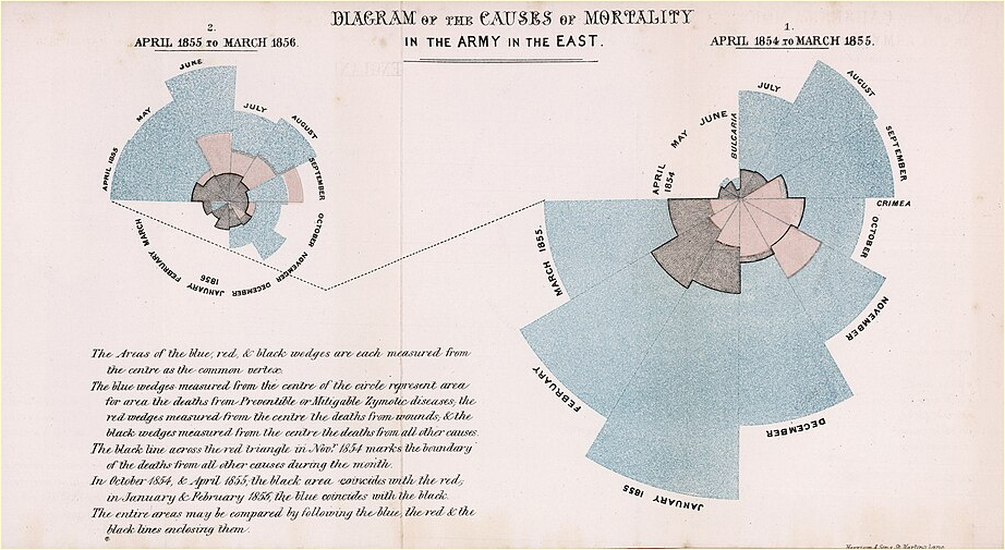
In 1857, English nurse Florence Nightingale used information graphics to persuade Queen Victoria to improve conditions in military hospitals. The principal one she used was the Coxcomb chart, a combination of stacked bar and pie charts, depicting the number and causes of deaths during each month of the Crimean War.
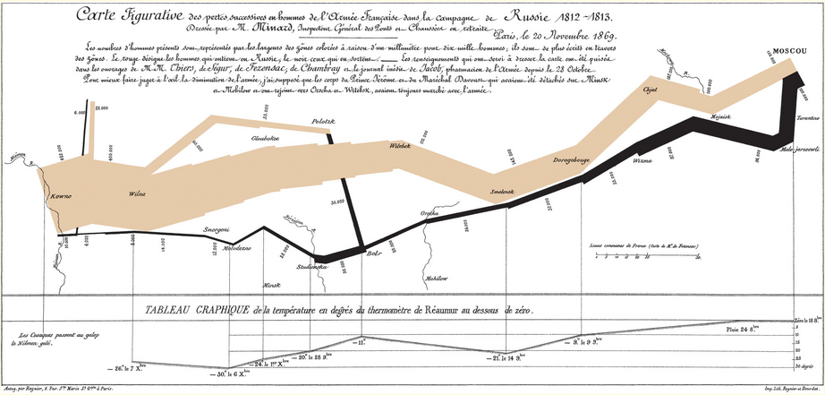
1861 saw the release of an influential information graphic on the subject of Napoleon's disastrous march on Moscow. The graphic's creator, Charles Joseph Minard, captured four different changing variables that contributed to Napoleon's downfall in a single two-dimensional image: the army's direction as they traveled, the location the troops passed through, the size of the army as troops died from hunger and wounds, and the freezing temperatures they experienced.
#### 2000s
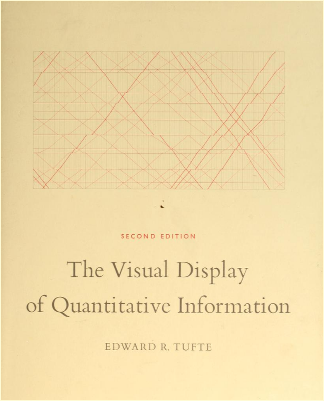
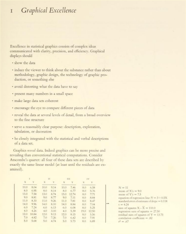
**The Visual Display of Quantitative Information** by Edward R. Tufte. 2001. [Archive](https://archive.org/details/visualdisplayofq00tuft/mode/2up).
**Graphical Excellence**
%%Footer Starts Here%%
---
![[Brain Icon 1.png|center]]
<b><font color="#ffffff"> <center>You might not have noticed it… but your brain did.</center> </font></b>
---
### Tags
### Linked Pages & Footnotes